Monday, 16 November 2009

Friday, 13 November 2009

Ratings.


The BBFC's Guidelines state that strong language like f*** etc, has to be uncommon at '12' or '12A' - puns on strong language is allowed. Moderate language like 'bitch' and 'twat' are allowed.
In our film the moderate language will probably be used, to refer to the other characters, or the groups will use them jokingly with each other.
For example - That tanorexic is such a bitch.

At '12' and '12A' moderate violence is allowed but it cannot be too detailed. They should be no gory moments.
There could be a fight between the chavs and emos.

Dangerous behaviour (for example hanging, suicide and self-harming) may be present in ‘12’ or ‘12A’ works but will not dwell on detail which could be copied or present those activities as pain or harm free. Weapons should not be glamorised in ‘12A’ and ‘12’ works. Discriminatory behaviour should not be endorsed by the film as a whole.
There may be infrequent sight of drugs misuse in a ‘12’ or a ‘12A’ but the portrayal should not be glamorised or provide instructional details.

Because of the social groups there may be self-harm/suicidal behavior present because bullying and stereotypical opinions will be used through out the film.
Chavs may carry knuckledusters but wouldn't put them to use.
There is a mention to drugs in the 'Scene kids' scenes but there will only be mentions not actual scenes.

Thursday, 12 November 2009

1. In what ways does your media product use, develop or challenge forms and conventions of real media products?

The Title of the Film.
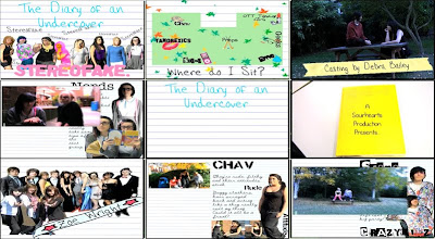
The title of our film is displayed in the first frame. It is produced on lined paper, just like the rest of the opening, to keep in relation to the scrapbook atmosphere. 'The Diary of an Undercover' is written in "Hannah's Messy Handwriting" in a blue font colour; 'Stereofake' is written in a bubblegum pink font colour with "Alpha Fridge Magnet". The line up of stereotypes is on the page with doodles on them and slight adjustments to make it look as though they have been drawn over.

This is fairly common to see this style of titles in "chick flicks" connected with college/school life. For example St Trinians. This has the whole doodle effect; however the doodles and titles are on walls not lined paper.
Mean Girls also has the two colour effect. 'Mean' in white and Girls in pink; this happens with all of their titles.

On the other hand, Angus, Thongs and Perfect Snogging has the same connotation with the girly font, but is displayed to the right of the screen while Georgia is running.

(click on the links to see the frame of the title of the film)

Therefore this genre of film has two different styles of showing the film title on screen.

Setting/Location.
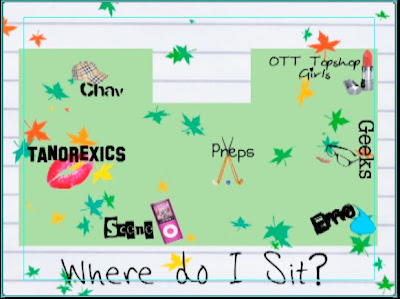
The reason why I've chosen the map as my setting/location shot is because it gives off the whole school/college cliche atmosphere. I could've easily used a live footage scene but they do not give the right feeling, compared to the map. Maps are not very popular in films, therefore it is unusual to see it appear in this film opening. However Mean Girls uses the map to define seating areas and to introduce the groups. Click here to see the map.
Even though we both use this map idea they are presented in two different ways. Ours is much more simple and is created by photoshop. Theirs is hand drawn with the cafeteria and outside area.

Costumes and Props.
Every film has costumes and props, therefore this is a typical media convention. In our frame you can see two 'Emo' girls sitting on a bench. The bench is the prop. Hannah is in a black vest, tights and tutu. Yasmin is in a red&black stripy jumper, black skirt and black tights - that is the costume. Many films from this genre, like us, rely on the costumes and props to separate the characters and to show journeys etc. For example, Cady from Mean Girls.

Camerawork and Editing.
This frame shows the transition between scrapbook and live footage. There is a still on every scrapbook page so that we could edit a smooth transition between scrapbook and live footage.
The reason I chose this as camerawork and editing is because we only used a range of shots, not zooms etc, because we wanted to keep out shots as simple as possible, and not to confuse the viewer. Therefore this shows the camerawork and editing.

Title font and Style.
This frame is from the first part of the title of the film. The title is split into two parts - the diary of an undercover; and, stereofake (with the lineup behind).
The font used is "Hannah's Messy Handwriting" which is used in all of the titles.
Girly/ Journal styled handwriting is a key element in this type of film; as shown above in 'the title of the film'.

Story and how the opening sets it up.
I have used the first shot we see for this frame because it sets the story up. We are shown a book and the camera then enters the book. This sets the story up because it shows we have gone into the book and the following clips are inside the book.
This is more common with fairytales/ disney films.


Genre and How the Opening Suggests it.
For this frame I have used one of the memory scrapbook pages. It shows a picture of a group at prom and 3 girl (best friends) with a girly banner with a name in it. This shows the genre because most girls have collages or photos on their walls, with all their best memories and friends; so when they look at this they'll think they've seen it at their house or a best friends house.
Wall Collage: 1 - 2 - 3
However wall collages are more for the audience to connect with, not to link to other films.

How Characters are Introduced.
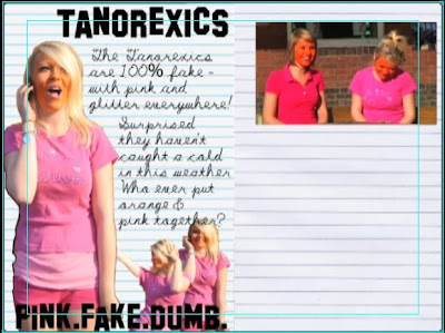
This shows how every character is introduced, but in this frame its just the 'Chavs'. There is a big picture of the main character of the stereotype; followed by a few little pictures surrounding them; the stereotype title in a font that represents that group; and, a little bit about the group filling in the space. On the other page there is a still which the live footage connects to. This is a good way to introduce characters. In St Trinian's they are introduced in a similar way - the head girl takes Annabelle through the dorm and says something about the group and then the shot freezes and the group name appears in a certain font. Chav.

Special FX.
We didn't use any special fx so for this frame I used the transition of Scene kid page to the live footage. I class this as a special fx because we zoomed into the still which then starts moving. We also brightened the live footage.
This is not very common. Special FX is like Star Wars and green screen etc - which is very common in sci-fi/ action films, not "chick flicks" etc.

2. How does your media product represent particular social groups?
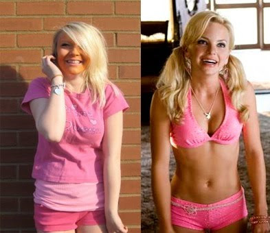

Emma "Tanorexic" & House Bunny

We decided to choose emma for the role of the tanorexic as she is a naturally giggly girl, and has blonde hair which fit the stereotype of a tanorexic. We got this idea from the girl from 'House Bunny' as she has the same stereotypical qualities.
They are both blonde, love pink and very giggly and ditsy.
Emma is practically the younger version of the House Bunny.
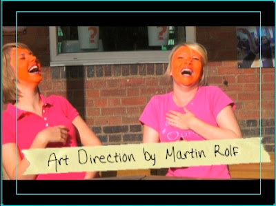
Ours is a lot more exaggerated, for comic reasons, hence the orange face paint; emma is also not an ex playboy bunny in our film, just playing a really blonde, self obsessed girl.
They both wear hardly anything, and what ever they do wear is pink & glittery.

3.What kind of media institution might distribute your media product and why?

Tilly: I found a photo I liked on photobucket, and it really caught by eye, so i decided to base my production logo on this. I chose to call it 'Colour Flash' because it fits with the image, and 'Flash' also refers to films etc.

Yasmin: I saw a picture on the internet that had the whole collaborated background with an envelope over the top; so i decided to create my own collaborate background but put a polaroid over the top. 'Sour Hearts' was a pun of sweetheart and it also sounds quite edgy and rememberable.

T: A production company creates ideas and motion pictures, tv programmes, and adverts etc - they may also find funding for the products they produce. Paramount have produced Angus, Thongs and Perfect Snogging & Mean girls.

Y: A distributor is someone reliable who would get the film out there and support it fully. Paramount Pictures would be the most reliable - they've been going for years and have already got films being produced for 2013.

T: The money could come from the National Lottery - Uk Film Council. They have funded St Trinian's and Kidulthood who have influenced us hugely.

Y: The production companies are written outside of the book. The three main actors are written on banners, name tags and masking tape. The rest of the main cast is on a 'Class 09' page. Costume design to Original Music is also written on tape to keep to scrapbook theme. Producer and Director written outside of the book. It all keeps to a scrapbook theme.

T: Our film influences are St Trinian's; Clueless; Angus, thongs & Perfect Snogging; Mean Girls; Skins; House bunny; and, Kidulthood.

4.Who would be the audience for your media product?


This is Shanelle Goodwin. She is 15 years and 7 months old, and lives in the suburbs of Leeds.
she dresses fairly straight forwardly - just jeans and a top. She enjoys sleepovers with her friends, and shopping at the weekends with her pocket money. She shops in places like H&M and River Island, Jane Norman, New Look, and Topshop.
She enjoys films like Mean Girls, Angus Thongs and Perfect Snogging, House Bunny, St Trinians, Sex and the City and Mumma Mia, she enjoys watching them at the cinema and also buying them later on DVD and watching them with her friends, and jelly and icecream.
They would watch Hollyoaks, Friends, Scrubs, Family Guy, X Factor, America's Next Top Model, One Tree Hill. The main channels would be Channel 4; E4; Living Tv; ITV; BBC Three; Comedy Central.
The music this girl would listen to would be anything in the charts, varying from pop, hiphop. r 'n' b, indie music - not really a 'rock' or 'classical' or 'dub-step'. Listens to Kiss FM and Radio 1 for the 'chart hits'.
I think our film would appeal to this girl as she is a stereotypical girly girl who enjoys typical girly things, therefore, if this film was shown at her local cinema, this may appeal to her, as it's similar to other films she likes, such as Mean Girls, House Bunny, and Angus Thongs and Perfect Snogging and St Trinians.

5.How did you attract/address your audience?

6.What have you learnt about technologies from the process of constructing this product?
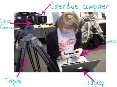
The Coleridge computer's had a lot more programmes than we've used before.
Video Camera was pretty simple to use, especially with the tripod.

Final cut was the main programme we used. We learnt how to fade in/out; transitions; how to build up our editing skills; adding sound; importing clips from the video camera; and also arranging clips etc.


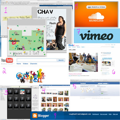
1- Photoshop
We made credits; the map and the stereotype profiles from this.
2- Google
We found images and sites from this.
3- itunes
We imported music via this.
4- facebook photos
We uploaded photos to this so we could access them from anywhere.
5- Facebook
We contacted each other via this.
6- Flickr
We uploaded our work/ timelines etc from this.
7- Vimeo
Our final/rough cuts, animatics and idents were uploaded to this.
8- Soundcloud
We uploaded our music to this - with garage band
9- Blogger
Where all our work/ planning is.
10- Garage band (we forgot to put the image on)
To help edit the soundtrack and for a tutorial as well.


We used this website (SBBFC.COM) to work at the guideline/rating for our film.


7.Looking back at your preliminary task (the continuity editing task), what do you feel you have learnt in the progression from it to full product?
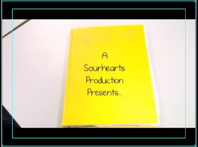
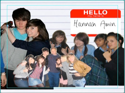
To be honest we don't have any of the preliminary tasks within our film opening because of the structure we've used.
If the film was continued, surely these tasks would be present.
The reason why these rules aren't present in our opening because, the nature of our opening doesn't need them; for example, we go from animated scrapbook, to the birds eye view of the map, to the profile pages of the stereotypes, and then to the live footage which is just a stationary shot (long/ midshot/ close up). It ends with the book closing, to show that we are not inside the diary anymore.
However, it is continuity task because it starts with the book opening and then ends with the book closing.


Sunday, 1 November 2009

Forward Planning.

Monday - work on animated scrapbook and soundtrack

Tuesday - Edit the visuals and the soundtrack, and if we have time edit the scrapbook turning pages.

Wednesday - Tutorial - Talk to Nick about animated scrapbook.

Thursday - Finish the soundtrack, get the last few bits together for animated scrapbook.

Friday - Finish putting together the animated scrapbook with the live footage, and record voiceover.

FeedBack for Tom and Louis


I really like this film opening, it really grabbed my attention and i would love to know what would happen in the rest of he film. I think they did a brilliant job of not giving too much away. By showing the general location of the film, but not giving too much away in each of the scenes. Never seeing either faces really builds up suspense.

The only fault i can make from this opening, is just the match on action when Louis walks into the shed, that could be made a little cleaner, but other than that i have no faults, and everything that needs to be there is there.

The music and the font for the titles, fit very well with the opening. They have done very well to sticking to the brief. I would definately want to watch more of that film.

Rough Cut

L3 - GROUP 8 (Yasmin & Tilly) Film Opening Rough Cut from cmdiploma on Vimeo.


Unfortunatly our rough cut is far from our final pollished opening. However, i think if we work hard is it possible for us to complete our final target. We didn't have much time to shoot our footage, as we were working with another group who also needed time to shoot their footage. So while we were unable to shoot any footage we were taught how to create our animated scrapbook, and also did some research into our background music.

So far i like the idea of the changes from the animation to the live footage, however i still think we still have work to do to make them clean transactions. We intend to change the music, as we need music created by ourselves, and not a backing track made by anyone else. So that's something we shall need to work on when we return after half-term.

We also still have the titles to add, and create and add in the first and end part of our animated scrapbook, which will have most of our titles in the shots. And finally once everything is in order, record our voiceover and create our backing music.

Sunday, 18 October 2009

St Trinians Trailer and screen grabs.
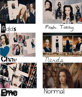

This is an image from earlier in my blog when we were thinking up idea's for our film opening. St Trinians was an insperation for our film opening, especially in the make over part with all the different stereotypes they styled Annabelle into. We took a few of the same sterotypes from this and also took some others to put into and make our film opening, but watching the make over trailer gave us a few ideas of how to dress our characters on our opening.

Tuesday 13th of October - Photoshoot for film opening


This is me, Tilly. I am playing the main 'Preppy' Girl.
I am wearing i blue, Jack Wills, knitted jumper, white
skinny jeans with white plimpsoles. I have simple make-up
with my hair pinned back to complete the look.


This is Hannah. She is playing the main 'Emo' girl.
She is wearing a black vest top with a black tutu, and
tights with purple starred knee high socks and black
plimpsoles. Her make-up was just tonnes of black
eyeliner, red lipstick, with her hair pulled across her face.


This is Yasmin, also producing this film opeing
with me. She is playing the main 'Geek'. She is
waering a white polo, with a grey skirt and cardi,
black tights, white plimpsoles, braces and glasses.
Very subtle make-up. With her hair pinned back
with a small bow.


This is Emma. She is playing the main 'Tanorexic' girl.
She is wearing pink hot pants and a pink vest top under
a pink 'drama queen' t-shirt, knee high socks with fake UGGs.
We covered her face in orange face paint to look like
really over-done fake tan, with pink lipstick and eyeliner.
Her hair, just plain straight and down.


This is me again. Playing the main 'OTT Topshop girl'.
I am wearing a blue dress with a red belt and heels. Lots
of mascara, and red lipstick, looking ready to go out
for a night on the town.


This is Hannah again, playing the 'Chav'.
She is wearing grey trackies, with a black
vest top with black plimpsoles. A lot of eye
make-up and foundation and blusher, with
consealer on her lips to make them look
lighter than her face. Her hair pulled over to
one side to achieve the chav look.


This is Yas again, playing the 'Scene Kid'.
She is wearing an i heart NY top under a
Hello Kitty jacket, with jeans and white
plimpsoles. Her make-up is mostly eye
make-up with a lot of colourful eye shadow
and mascara. With her hair up and a big fringe.

Sunday, 11 October 2009

Feedback

Good work- glad to see you have been able to catch up

Storyboarding


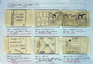
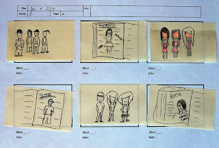
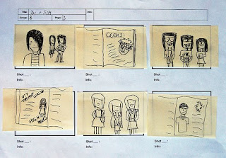
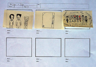
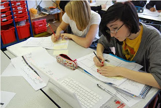
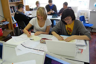
These are photo's of our storyboard and Yas and i in the process of drawing them up. I think that storyboarding is really. realy important, it really made us think about how we want our opening to look like, and how it would all fit together, and in which order things would go in. We found it important in this process of have an overall view on how this opening would move into the film, and have an idea of the plot for the film if the whole thing were to be made.
The process was good fun, and i learned a lot from it. It was a good idea to do each frame on postit's as this gave us the advantage to move them around if we didn't like the order.

My Final Ident


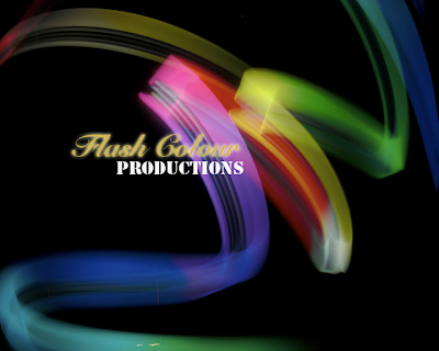
I am happy with my final Ident. I originally had the image across the whole screen, however I changed this when i made it into film and added effects to it, simple to give more or an effect to the audience. The music I liked, as it was melow, and fit well with the texts and image fading in and out. I would have liked more time to fiddle around with the effects and explore more backing sounds, but i am pretty happy with my final ident.

My still ident


I came up with the idea of 'Flash Colour' as when i found my picture i thought it went well together. The image i found really captured my eye as it the was almost a bit like an abstract rainbow, and this really interested me. I started to think what i could do with it. I strugled on photoshop to make my image not look like a postcard, I managed to get around that by placing the text together around the image.

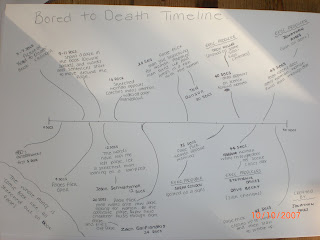
Bored to Death Timeline


On my timeline for 'Bored to Death' i managed to write down each scene, and at which time they start. I also wrote down in which scene an opening title comes up, and at what time during the scene it appears. I found this a long process, as i had to keep stopping the sequence to get everything put down accuratly. However, i believe it is a good process to do and go through, as it gives you a clearer understanding what goes on.

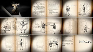
Bored to Death Opening titles


I chose this opening sequence to do as i think it relates to my film opening well will the page flicks. Although my film opening is not comic based, I felt this opening made me see how well the page flicks can fit each scene together, it also showed me how smoothly each scene can run into one another. I hope I manage to produce that in my film opening.

9 Key Frames from Bored to Death


Tuesday, 6 October 2009

Our Pitch Idea

We decided to use elements from both of our films to create our pitch.

This is a story produced though the eyes of a normal girl and her journal, about her life at college.
Her journal describes the different social groups she faces at college. including: chavs; tanorexics; preps/jocks; over the top topshop girls; geeks; scene kids; emos, and; the normals (her group).
The story is mostly voice over, but there is also a lot of dialogue between the different clashing groups.

The journal is a key element in the opening. There'll be pictures of the different groups and writing about them as the girl flicks through the journal. Close ups of the journal and character pictures, turn into real life footage of the people, at college.

The opening closes with a group shot of the leader of each group, doing a signature stereotype gesture. For example:
Chav - swearing
Geek - adjusting glasses
tanorexics - looking in mirror
emo - hair flick
scene - over the top pose
prep/jock - holding cricket bat/ rugby ball etc
Topshop girl - adjusting skirt/ dress
Normal - Girl with journal (middle)

Sunday, 4 October 2009

feedback

well done Tilly. Coming along well
Brief 1

Action film aimed towards 15-25yr old males

Beast tries to take over the world, while local man saves the towns people, and becomes a hero.

Brief 2

Film aimed towards males - Thriller

Young child gets snatched from mother by demonds, and mother goes on a hunt for her missing child, facing the underworld.

Brief 3

Independant film featuring a young prodaginist

A girl telling her life via her diary, meeting different people as she goes a long.

Brief 4

Animated featuring to appeal to adults.


Husband and wife tackle the worlds problems, but can the can they save the day, and their marriage?

What is continuity editing?

180 Degree Rule

The 180 degree rule, is just a guidline for the person working the camera. It's so that the shot appears the same and flows well. If a scene was being shot over one characters right sholder then it should then be shot on the other characters left sholder so it doesnt make the scene become dicombobulated.

Match on Action

Match on Action is to connect two different shots. For example, a close up of a hand opening a door, and then a long shot of the person walking into the room from inside the room. It's difficult to achieve, but with the right timing, it can really make an inpact.

Shot/Reverse Shot

When two characters are having a converstation, Shot/Reverse Shot works well as it focus' on just the character who is talking. Flicking back and forth as the conversation continues.

Our Video

Friday, 2 October 2009

Credits For Opening Sequence

A Sour Hearts Production presents
A Colour Flash Production film

(cast) Helen Smith
(cast) John Brown
(cast) Zoe Wright

Costume Design by Marilyn Williams
Art Direction by Martin Rolf
Production Design by Sarah Johnson
Casting by Debra Bailey
Film Editing by Phillip Hyne
Cinematography by Rose Smart
Original Music by Hans Zimmer
Produced by Tilly Wright
Directed by Yasmin Murr

Main Title

Monday, 28 September 2009


TITLE: Forrest Gump
INSTITUTIONAL INFORMATION- Paramount Studios, A Steve Tisch/Wendy Finerman Production,
JOB TITLES: director - Robert Zemeckis, Casting - Ellen Lewis, Co-producer - Charles Newirth, Executive Music Producer - Joel Sill, Vusual Effects Supervisor - Ken Ralston, Casting Designer - Joanna Johnston, Edited - Arthur Schmidt, Production Designer - Rick Cater, Director of Photography - Don Burgess, Screenplay - Eric Roth, Producers - Steve Tisch, Wendy Finerman and Steve Starkey.
MUSIC and OTHER SOUND: Music - Alan Sivestri.
MAIN CHARACTER INTRODUCED: Tom Hanks
MOOD SETTING THROUGH SETTING/LIGHTING: Mellow
INTRODUCTION TO ACTION/STORY: Tom Hanks picking up the feather and putting it into his suitcase.
SOMETHING TO CAPTURE AUDIENCE INTEREST: The feather floating.

In the opening to Forrest Gump the titles of each job title fades in and out as the feather is floating in the background before being introdced to the main character.

Feedback

Tilly- this does not represent the amount of work that I suggested you need to put in on the blog. Where is the other task?


We found it particually hard to remake this part of the opening. However, we found a wall which we could stand on and hold the camera up high, this helped us create the birds eye view shot.

Juno


This is our re-make of the opening to Juno, our task was to get it to look as close to the original as we could. However, i found this hard as we were not allowed to take the cameras off the Colleridge campus, so it was hard to find places to shoot some of the scenes, such as the scene that has a van drive past, so instead we found a parked van on site and used that as part of the background. Also the birds eye view of Juno were hard to achieve, however we managed to move around this by finding ramps and using the tripod and lifting it, but this did leave the shot a little wobbly. We had to plan this carefully, and make sure that we had all the shots carefully planned out in a storyboard, this was a long process as we had to stop at each scene, draw it and time how long each one was. I was pleased about some of the work we achieved, that we managed to fit it all together, and we did finally find places to shoot some scenes. It was a good experience and it gave me more of a chance to fiddle around on Final Cut and do some more fading and cutting in and out. All in all i found this activity a good experience and fun to do.

Monday, 21 September 2009

Updated feedback

Good choice of clips and points about them

pete

Student Film


Strengths

The opening titles are really well presented, with the movement across the screen.

The setting is good on the bridge with the graffiti.

The background music, and the muffled effect on at the first bit of proper dialogue.

The fading between each a shot and an opening title.

The high camera angles when the boy is pointing the gun at the other boy near the start.

Use of blur.

Weaknesses

The backing track at the end could have been something a bit more sharp than mellow.

Some of the lighting was a bit off.

All in black and white.

Film Opening


I really enjoyed this film opening, as the chase really gripped you and wanted you to watch further to see what may happen in the rest of the film. I liked the camera work, with all the different angles of shots and the quick, snappy enterchanges from shot to shot.

I also liked where the opening was set, in a busy crowd of people to begin with, which gave more of a thrill factor to the chase, and then they move away from the crowd to give more of an intense feeling, which are both used to really grab the audiences attention, and want to watch on to find out why James Bond is chasing this guy and what he has done.
This blog will be the evidence of your research and planning for the AS coursework, so there needs to be lots on it and lots of detail to it.

All the tasks set will help build up this evidence, so if you don't complete them you will not be able to access the higher marks/grades.

Please complete the tasks set. I shall expect to be able to give you feedback on them tomorrow.

Pete

Thursday, 17 September 2009
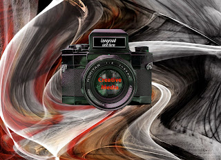

I chose two different images from flickr and 'photoshoped' them to create this new image. In photoshop, i used the warp technique in the background to make the original pattern a little more distorted. I then cut the camera out of my second picture and placed it on top of the, now warped, image, and then changed the saturation to give it the greenish tint. I then added some text to the new image in the middle of the camera and then at the top of the camera as well, however, before adding the text at the top of the camera, i had to get rid of some already existing text there, i did this by using the box tool and putting it around the text and painting it black ready for my new text.

Wednesday, 16 September 2009

My Video

When making this film i learnt how to cut short bits of film down and fade them together along side music, and also how to speed bits of film up, and also how to add text, and get that moving across the screen. I enjoyed fiddling about with Final Cut, and learning how to do new these things. I think that what Tom and I have have produced is fair for my first time, and it will be interesting to see what else i may produce as my knoloedge of Final Cut progresses.

Tuesday, 15 September 2009

Mood board for Shifty

This is the mood board i created with my group for the film Shifty.


We chose cut outs of mugs shots and and words like 'addiction' 'solid' and 'dodgy' as they relate to the topic of the film. We have a few images and words which relate to drugs and the effects it can have on people, such as addiction. And we have a lot of different men who could fit the roles of the charaters in the film.

Saturday, 5 September 2009